The Challenge
Capturing Essence, Not Just Images
The client came to us with a product that creatives love: a minimalist black camera built for creators, storytellers, and documenters. But the brand lacked emotional resonance. Our challenge was to develop an identity that felt analog and authentic evoking nostalgia, creative purpose, and the soulful calm of wooden desks, workspaces, and quiet process.

Our Approach
Designing Stillness, Framing Intention
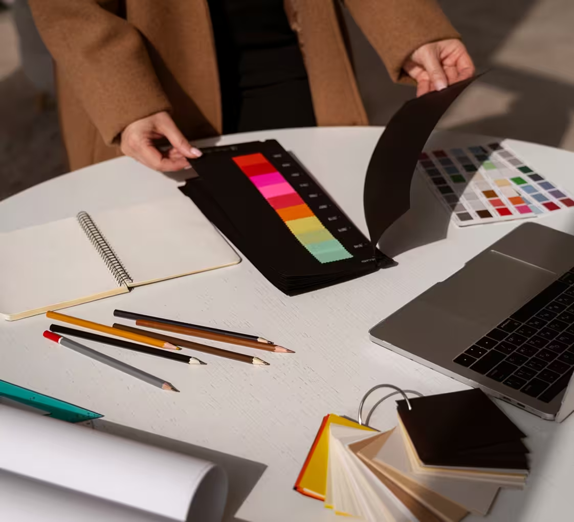
We drew inspiration from editorial photography, Japanese stationery, and slow living aesthetics. The brand language was rebuilt around presence earthy tones, crisp lines, and tactile textures. Typography was restrained yet refined. Each design choice echoed the rhythm of a shutter click: deliberate, grounded, expressive.

The Execution
From Workspace to Website
We translated the brand across physical and digital spaces photography guides, packaging, website UI, and launch content all echoed the desk-and-camera visual metaphor. Natural lighting, organic textures, and lifestyle setups made every brand touchpoint feel like stepping into a well-composed frame.
Outcome
Turning Craft Into Connection
The rebrand helped the camera resonate with a growing creative audience. The product felt less like gear and more like a ritual. Sales increased post-launch, and community engagement grew organically through UGC and workspace showcases. The camera became more than a tool it became part of the process.