The Challenge
Capturing Raw Creative Energy
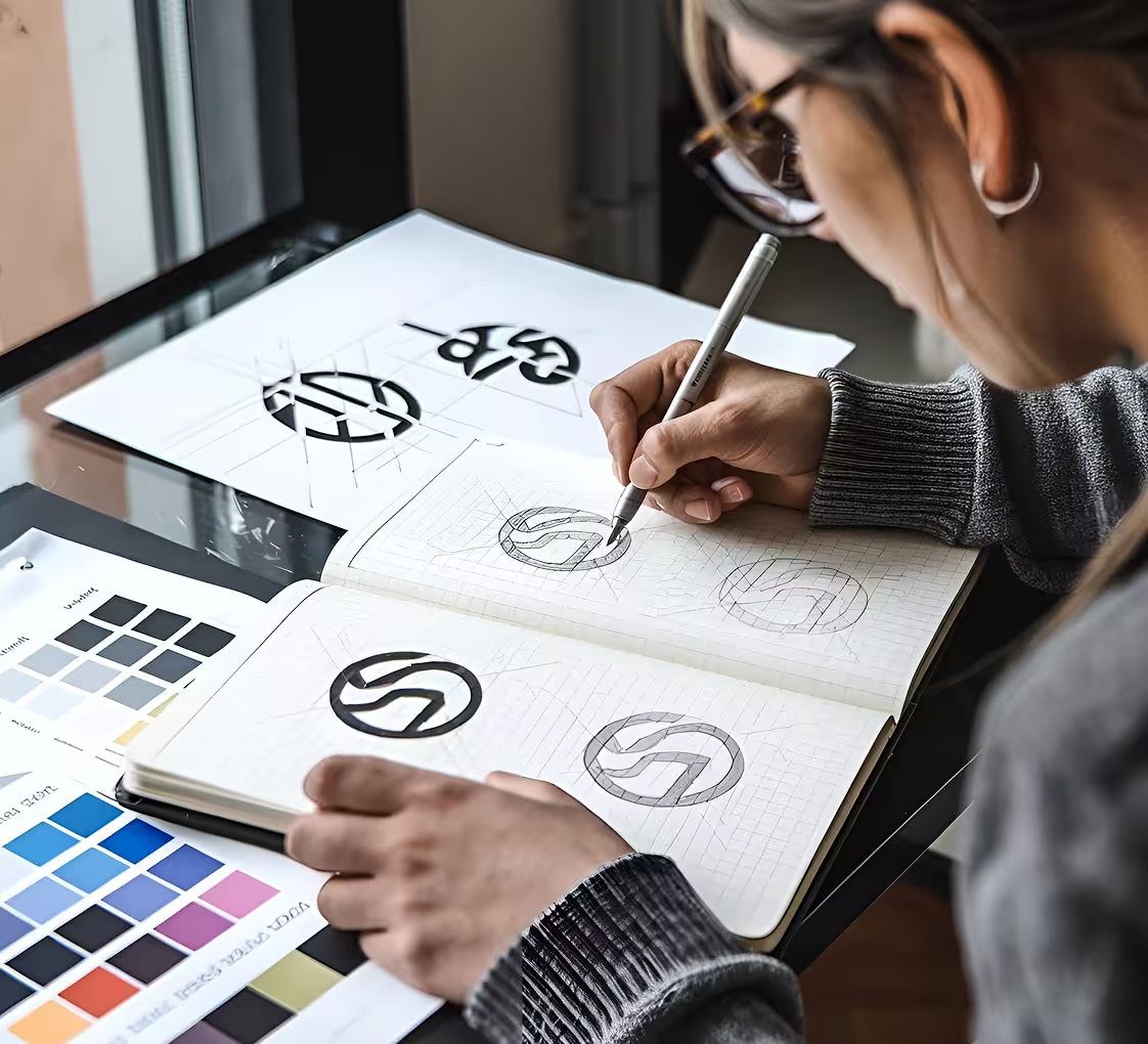
The client wanted a brand expression that felt personal, unfiltered, and deeply rooted in artistic process. The goal: build a visual identity inspired by sketchbooks and type journals a system that feels hand-crafted, yet intentional. Our challenge was to keep the design raw without losing structure, and expressive without losing clarity.
Our Approach
Typography With Soul, Sketches With Purpose
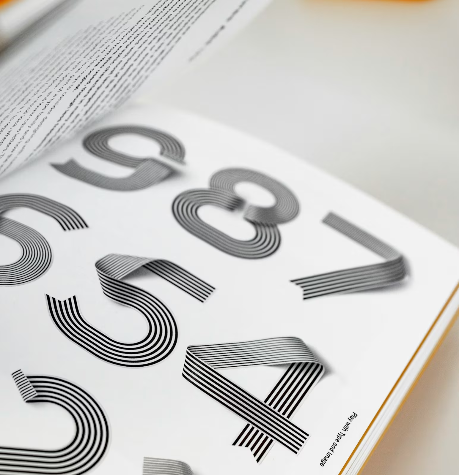
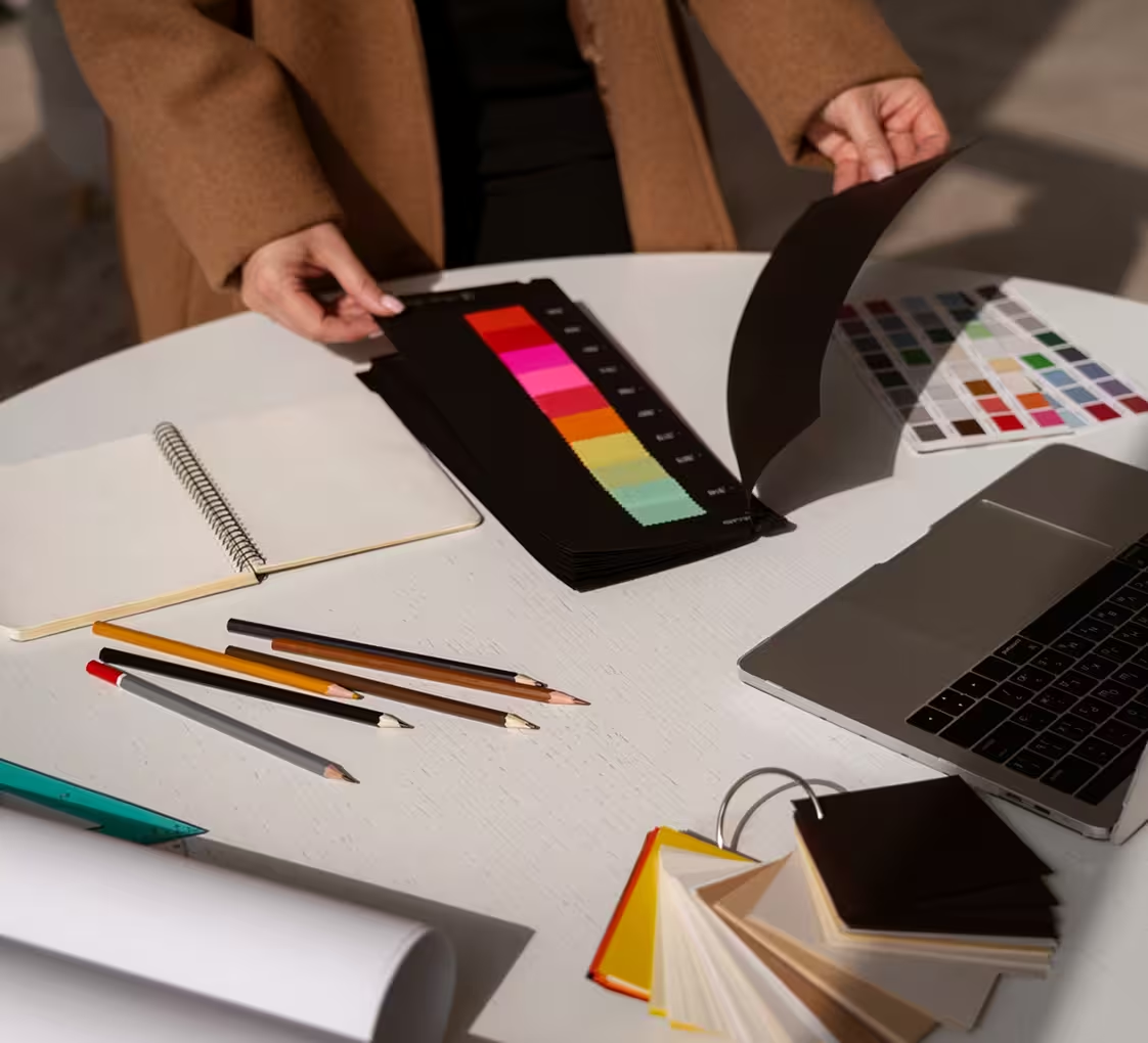
We dug into the rituals of analog design scribbles, scrawls, and margin notes. Custom type treatments were created to feel drawn, not designed every line, curve, and ligature filled with motion. We paired textured brushstrokes with modular layouts, blending structure and chaos into a cohesive visual rhythm that felt honest and human.

The Execution
From Margin to Mainframe
Once the language was defined, we built a scalable system sketch-inspired assets, type-forward templates, and brand guidelines that leave space for imperfection. The identity came alive across mediums: digital layouts with penciled accents, print pieces echoing notebook spreads, and branded elements that look like they were pulled straight from a designer’s desk.
Outcome
Turning Process Into Personality
The sketchbook-inspired identity gave the brand a powerful, personal tone. Audiences resonated with its honesty and energy leading to higher creative engagement and deeper emotional connection. What started as pencil lines became a voice a flexible system that let the brand speak with its own, imperfectly perfect handwriting.