The Challenge
Brewing a Shelf Ready Story
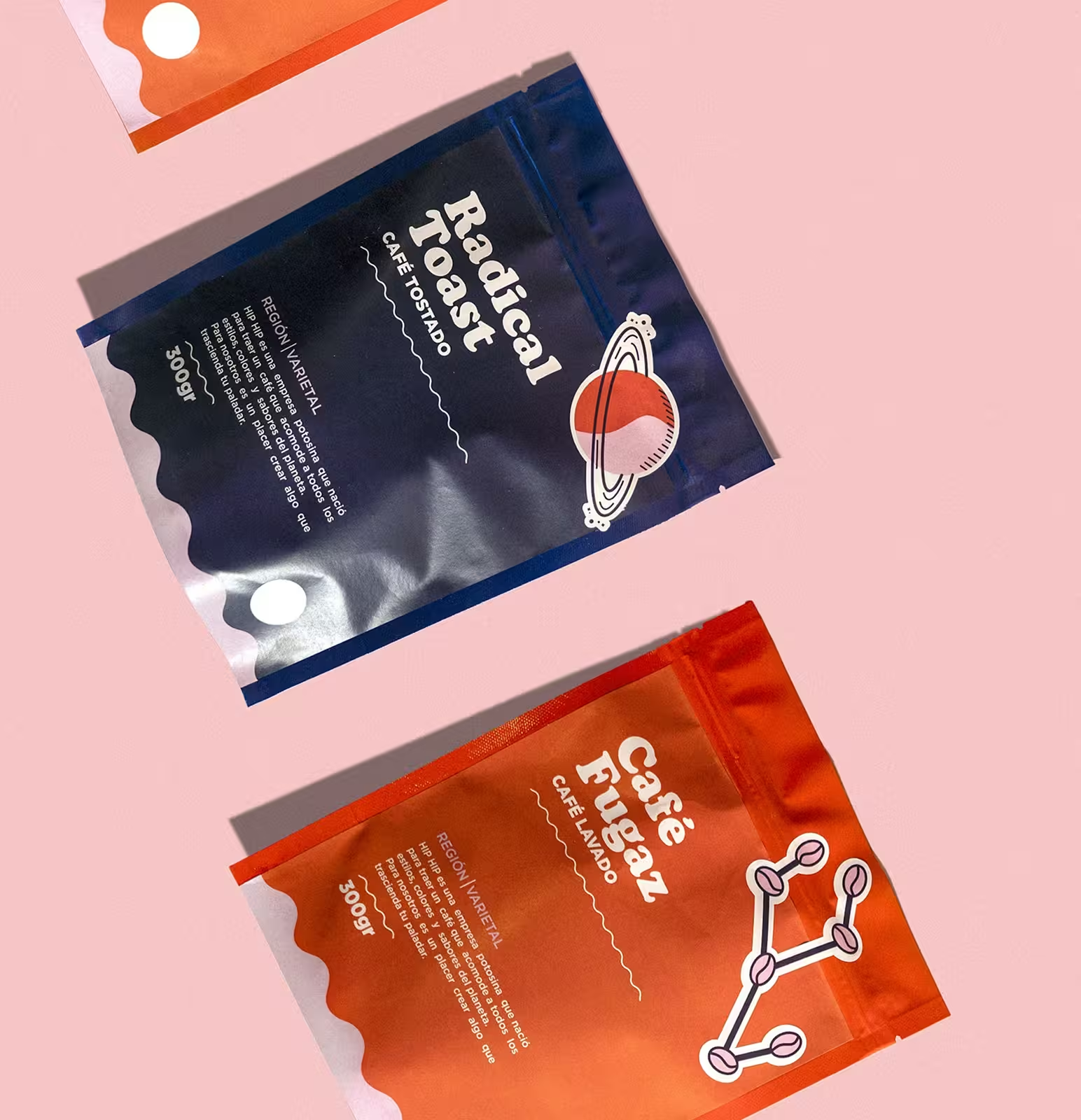
The client came to us with a bold ambition: build a packaging system that reflects the personality of their roasts playful, rich, and bold while standing out in a crowded market. Our challenge was to create a brand identity that’s instantly recognizable, easy to scale across SKUs, and emotionally resonant with a wide range of coffee lovers.
Our Approach
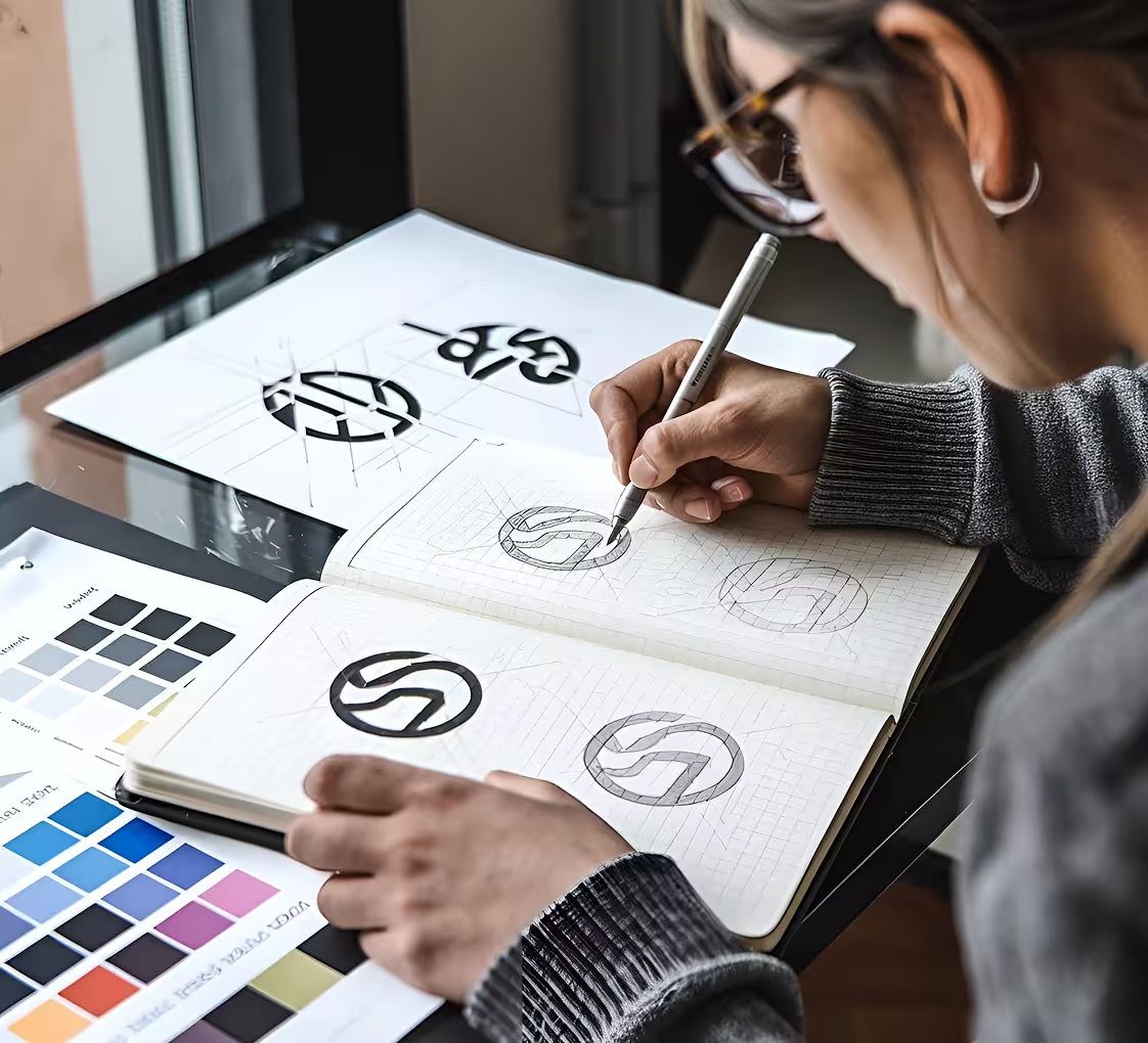
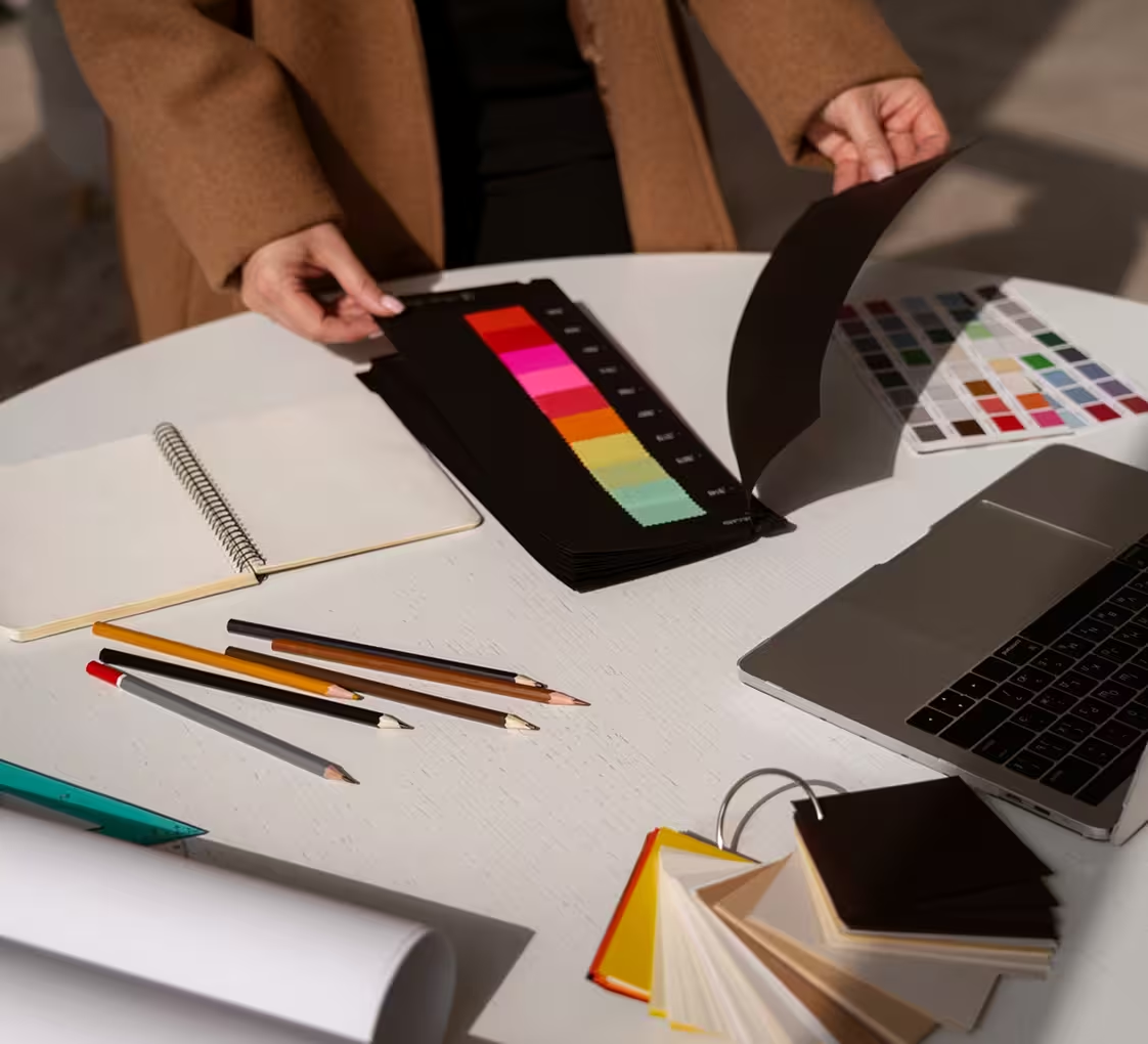
Layering Flavor Into Form
We started with the beans metaphorically and literally developing a visual language that blends coffee culture with bold graphic storytelling. Inspired by jazz album covers, neighborhood cafés, and morning rituals, we built a system of custom illustrations, vibrant color palettes, and character-driven copy. Each pack was treated as a chapter in the brand’s bigger story.

The Execution
From Roast to Reveal
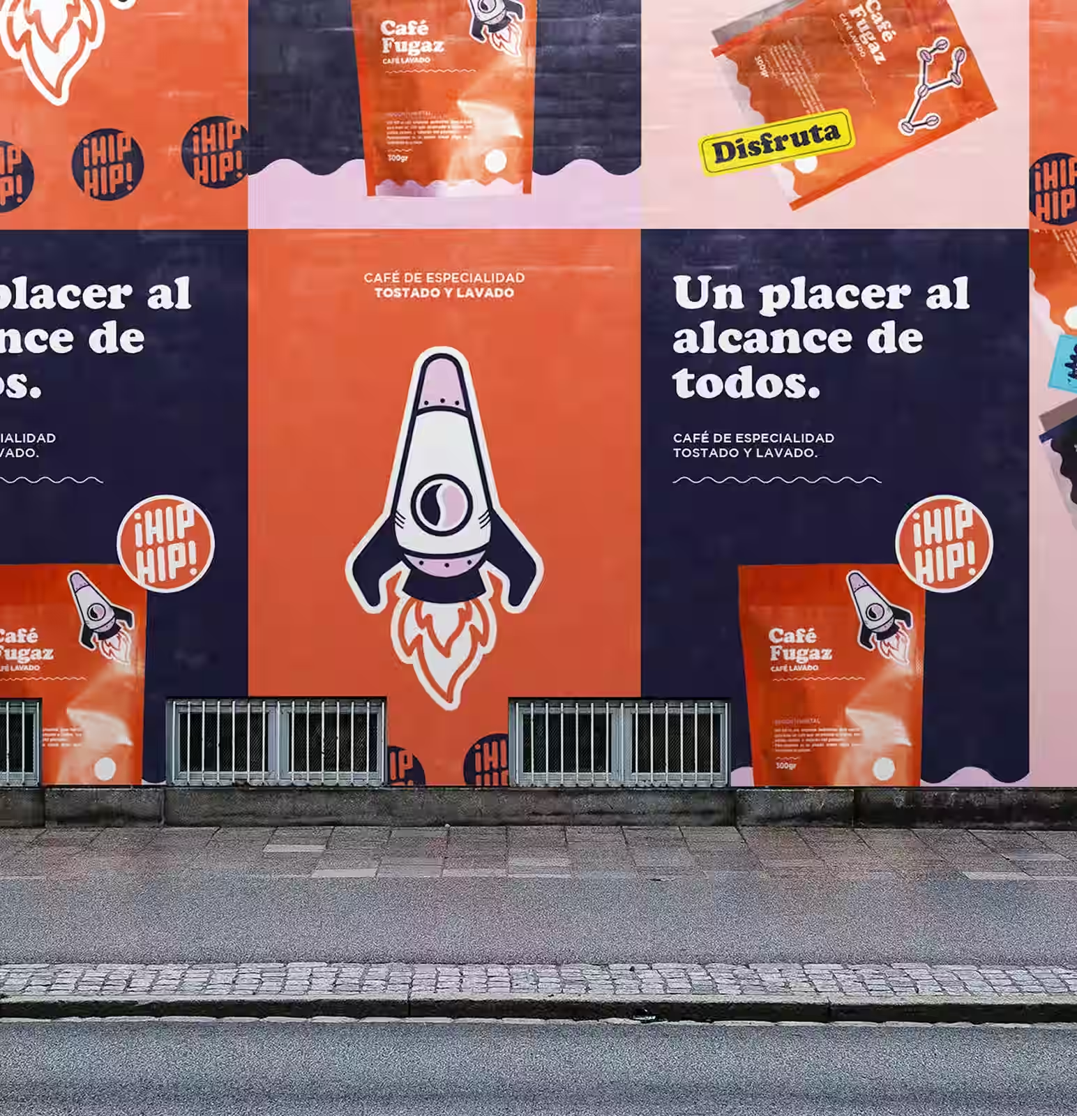
With the visual identity in place, we applied the system to flexible packaging formats ensuring visual punch from the first glance. Each coffee variant was given its own distinct mood through color blocking, expressive typography, and playful characters. The designs were optimized for digital and shelf impact, creating a unified experience across touchpoints.
Outcome
Packaging That Starts Conversations
The refreshed brand identity helped the client carve a distinctive voice in a saturated space. Customers shared the designs online, stores reported stronger shelf presence, and sales of new blends surged. More than just packaging, the project positioned coffee as a cultural moment something to enjoy, display, and talk about.